Here's a couple of map projections I found interesting along with how they skew the distances from Washington DC, United States and Kabul, Afghanistan. There are three different type of map projections, with two maps for each projection. All maps use the World Geodetic System 1984 Datum as a reference point.
Equidistant Map Projections:
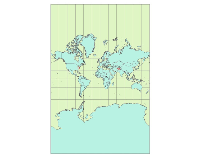
Map 1: Equidistant Conic Map Projection
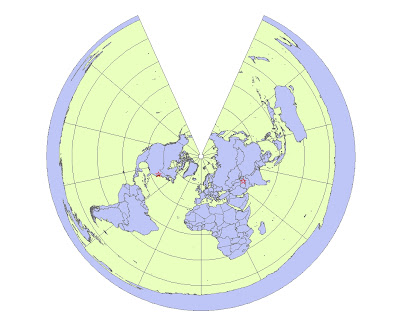 |
| Distance From Washington D.C. to Kabul: 6,972 miles |
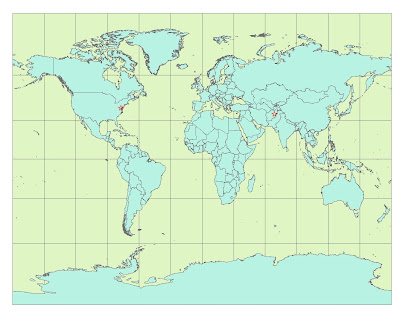
Map 1: Equidistant Cylindrical Map Projection
 |
| Distance From Washington D.C. to Kabul: 5,065 miles |
Equal Area Map Projections:
Map 3: Equal Area Bonne Map Projection
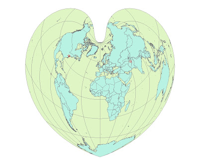 |
| Distance From Washington D.C. to Kabul: 6,738 miles |
Map 4: Equal Area Sinusoidal Map Projection
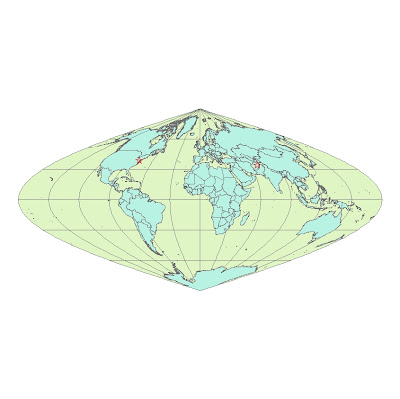 |
| Distance From Washington D.C. to Kabul: 8,098 miles |
Conformal Map Projections:
Map 5: Equidistant Conic Map Projection
 |
| Distance From Washington D.C. to Kabul: 7,151 miles |
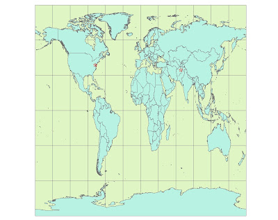
Map 6: Equidistant Cylindrical Map Projection
 |
| Distance From Washington D.C. to Kabul: 10,112 miles |
Even though it is agreed that the world is more or less the shape of a sphere, how do people visualize the earth? The use of map projections allows one the ability to unravel the earth and lay it out on any chosen surface. One way to understand the concept of map projection is to relate it to how when shining a flashlight on an object next to a wall, the shape of the silhouette that appears on the wall varies on the angle of the flashlight and it’s positioning with respect to the object. Of course the true shape of the world cannot be retained, so some aspects have to be skewed. Three main types of map projections are: Equidistant, Equal Area, and Conformal map projections.
Equidistant map projections preserve real distance from map surface to ground surface in a way where that the distance from the center of the map projection to any other place on the map is the same. The two maps shown above are examples of equidistant map projections. The conic map shows how the world is viewed if projected onto an area of a cone. The cylindrical map shows the world viewed if it were to be wrapped around a cylinder and unrolled. There are definite distortions of area on the map.
Equal Area map projections maintain the same proportional relationship to areas and help retain the actual shape of areas on the Earth’s surface relative to a specific point. From the Bonne projection and using the WGS_1984 datum, the projection of the world looks heart-shaped. The Sinusoidal projection gives a different view of the same world. The countries in the center of both projections look like their usual shape, but as one views the extremities of the map, it can be seen that most countries are warped based on the distance away from the central point of the projection.
Conformal map projections are unique because they must keep all latitude and longitude lines intersecting at right angles, but do not necessarily have to retain area or distance. From the maps shown above, it can be seen that shapes and areas are retained locally, but not universally. The Stereographic map seems to be the most common conformal map projections and retain most shapes and areas on the map. But if looking closely, the northern and southern parts of the map are definitely disproportional and that can be seen because of the size of Greenland, Alaska, and Antarctica. There is even a larger disproportion on Mercator map.
All in all, there are so many different ways to view a map and so map different ways a map can be viewed. Depending on what a person is looking for, accurate distance, accurate location, or accurate area, it may influence which map projection they decide to utilize.


