Map 1: Cambodia Bombing Map, 1965-1973

This map visually depicts over 100,000 locations within the Cambodian border, where the US military dropped bombs during the Vietnam War. During this time, Cambodia was considered a neutral country and all US military action in Cambodia was not reported. This map is interesting because it was stated that the US justified bombing Cambodia because North Vietnam was using the Cambodian border as a route to invade South Vietnam. However from observing this map, the US must use the term, “border” very loosely, since bombing sites have been found as far in as the western half of the country.
Map 2: San Francisco – Crime Rate Contour Map
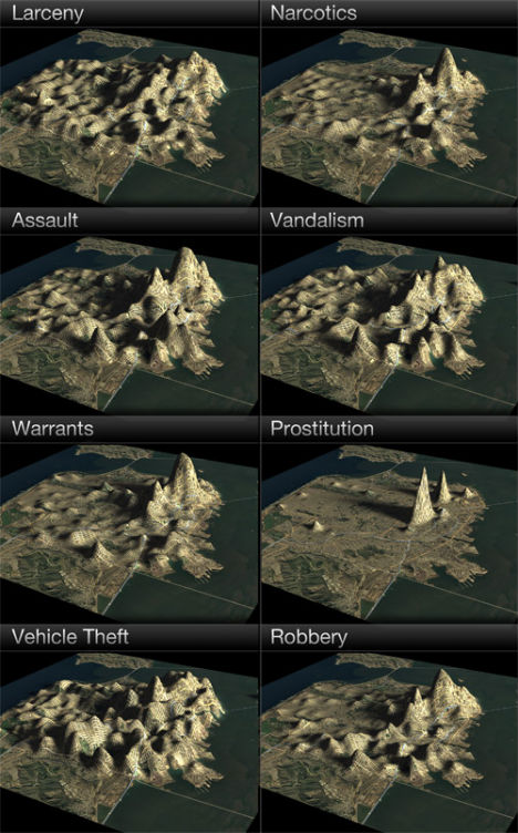
The map above shows an alternative way to display statistics in a geographical perspective. This three-dimensional map represents various reported crimes in the city of San Francisco, CA. Instead of using elevation as the typical third visual dimension on a map, the number of crimes is used. This allows viewers to clearly see the distribution of data within certain areas. An example of this is seen with the shape of the prostitution rate and how it peaks along a certain street within the northwest region of the city.
Map 3: Unintentional Fall Death Rates in US for Men 65+, 1996-1998

This map shows statistical data, with the use of shading and percentages, of elderly men have died from an unintentional fall. What is interesting about this map is how it was created to reinforce the idea that unintentional fall prevention is needed in certain areas of the United States. Organizations and agencies are able to use map that incorporate certain filtered data which help benefit their cause.
No comments:
Post a Comment